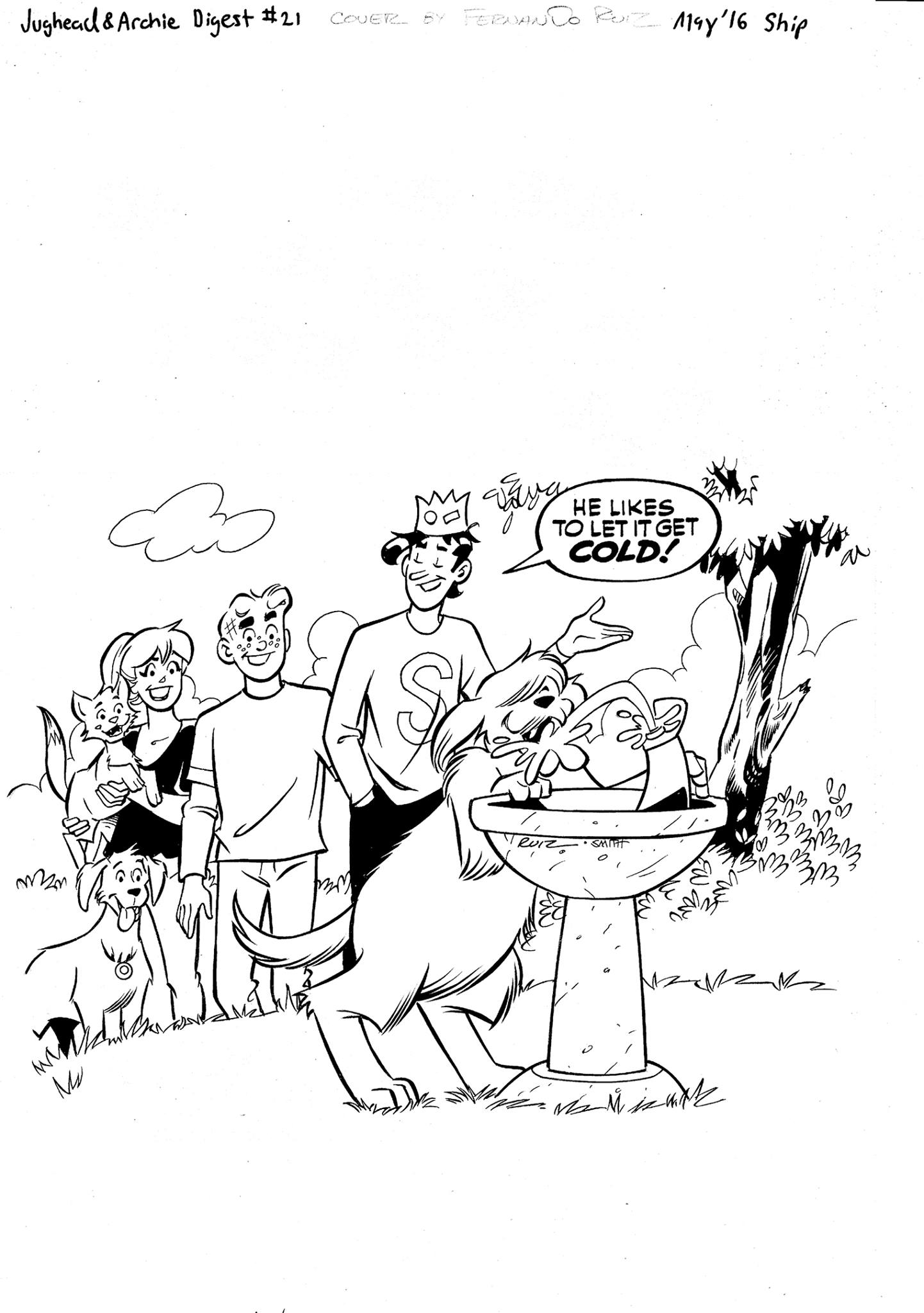
Here is my art for the cover to JUGHEAD & ARCHIE #21. I drew the pencils. The inks are by the legendary Bob Smith. This is the inked version of the cover as I originally handed it in.
On my last day at the Archie offices, editor co-president (whatever his title is these days) Victor Gorelick calls me into his office and shows me this cover which I’d handed in sometime earlier. “It’s not funny,” he told me. I told him I agreed but I explained that I drew what was asked of me and there’s only just so much I can do as the artist to make some of these gags funny without doing extensive rewriting of the gag… which goes beyond what should be expected of me and in all honesty, what I’m willing to do. Believe me! They weren’t paying to rewrite and fix this stuff. I just drew it!
Victor suggested that the cover would be funnier if the background characters looked impatient and upset that Hot Dog was hogging the water fountain while they baked under the sun. I agreed. I thought that would be funnier, but I reminded Victor of Archie Comics’ standing mandate that ALL characters on every cover be smiling always. It’s a dumb rule that I always disagreed with. I can appreciate the sentiment behind it in this day and age of relentlessly miserable, brooding, dour comic book characters everywhere, but to make it an absolute decree is going too far. I’ve seen too many good gags undermined because the characters HAVE to be drawn grinning like idiots. As I tell my own students, there are no absolutes in comics. If something works, it just works! Victor was aware of the mandate and again understood why I drew it the way I did. He suggested I redraw the faces with over-heated, exhausted impatient expressions. He would try to get it past the mandate. Victor also suggested that I redraw the water in the water fountain so that it was over flowing and splashing everywhere. I thought agreed with both suggestions. They would definitely improve the cover.
I sat down right there in Archie’s art department (or whatever they call those soulless cubicles) and I made the changes on an overlay. The changes were pretty extensive but I really wanted the cover to be the best that it could be. I handed in the revisions completely unaware that this would be my last visit to Archie. After turning the cover in, I asked about getting some new work and the production manager informed me that he had nothing for me and there wouldn’t be anything for me for the “foreseeable future.” No one else spoke to me about that!
Regarding the cover, I never heard anything more about it until I saw the final cover in print on the actual book. It looks like Victor was over-ruled and the original grinning faces were kept. The addition of the over-flowing water was kept though so I guess that improves it somewhat.
Here’s the final cover:
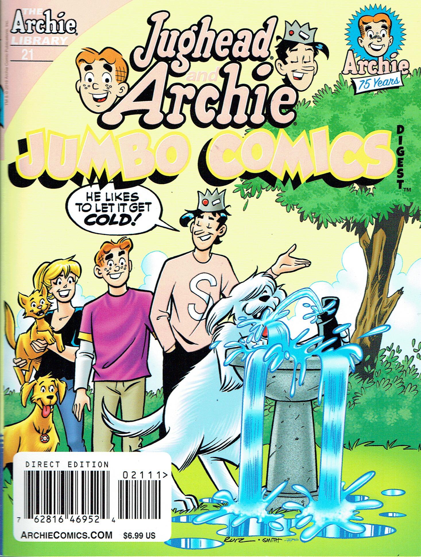
On another matter, for the past few years, Archie has been fond of what it calls “5th ink colors.” Basically its the addition of one gaudy, overly bright color that gets overused all over the cover. Its usually a day-glo orange, a lime green, or some other tacky tint that stands out like a sore thumb. I’ve said this before every chance I’ve gotten, but I CAN’T STAND THESE COLORS! I don’t blame the talented colorist Tito Pena. That poor guy has to do what he’s told just like I did despite the stupid mandates. In the end, the book ends up looking infantile and cheap like a baby’s coloring book from a cheap dollar store! The colors are a bit washed out in this scan. Another side effect of the horrible 5th ink colors is that they don’t reproduce well! Ugh!