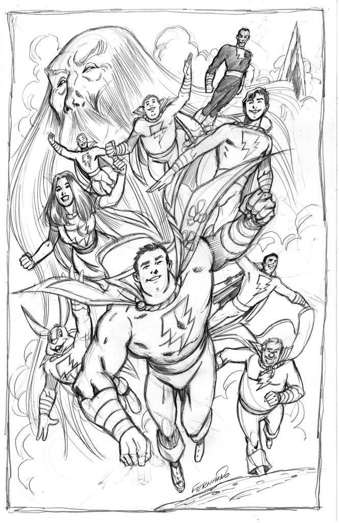
“SHAZAM!!” Here’s DC Comics’ Marvel Family. At some point, DC changed the team name to the Shazam Family. I always enjoy drawing Captain Marvel and his cast right down to Hoppy the Marvel Bunny (I guess he’s the “Shazam Bunny” now…?)
The Big Red Cheese has been drawn in many ways over the years with varying details to his costume but this is my preferred version.
No flap. I know some artists love to add the flap and sometimes add the additional clutter of a button for the flap and even additional gold trim on the flap. Ugh! Some artists really have an aversion to simplicity and can’t resist the urge to pee all over the snow. The “flap jacket” is always drawn loose fitting and kind of baggy making Cap look puny inside his own uniform.
I like the simple yellow band for a belt. Lately a lot of artists prefer drawing this as a sash wrapped and tied around his waist. I know some of these details were drawn by original Captain Marvel artist C.C.Beck, but they were all fairly quickly phased out leaving the Marvels with my preferred simple, streamlined versions of their uniform.
The wrist bands should not be metallic bracelets. They should be four simple gold bands consistent with the four stripes of a naval captains uniform.
The cape should be short and should not extend past Cap’s waist. I also prefer the flowers on the cape and for the love of the Baby Jesus… NO HOOD!!
The boots should feature a simple flap and let’s not be too flamboyant about it. He’s not a pirate and this isn’t a Dave Cockrum design. There should also be a simple stitching running down the center of the boot.
I also prefer a simple, SMALLER lighting bolt emblem. I don’t like big chest-consuming insignias.
That’s it. Those are my requirements for my preferred Marvel Family uniform. What are your preferred looks for the Marvel Family? Please let me know in the Comments below!
