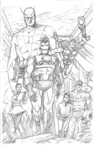
Credit for the inspiration for this one goes out not only to the King himself, Jack Kirby, who drew the original panel on which this piece is based, but also to my longtime pal, Gene “The GeneLantern” Cahill.
Back when I was a young college student at good ol’ Caldwell College (Now Caldwell University) in Caldwell, New Jersey, I used to work part-time for Gene at the comic shop he managed, Timewarp Comics & Games, in nearby Cedar Grove, New Jersey. Gene taught me a lot about comics in those days especially on that special era of comics which we both shared a passion for, the Silver Age. I was more of a DC guy but Gene was a huge Silver Age Marvel guy. His favorite characters were Iron Man and Captain America. It was Gene who introduced me to this panel for the very first time by way of a reprint in the Marvel Masterworks edition of The Avengers. It was one of his favorite panels and it quickly became one of mine too. It stuck with me all these years and this summer, when I started revisiting some of my favorite Silver Age Marvel covers and panels, I just knew I had to give this one a shot.
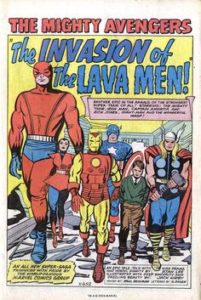
Here’s a look at the original panel as masterfully drawn by Jack Kirby himself and as it originally appeared in The Avengers #5:
As you can see, I took a few creative liberties from the original. Some of these edits were out of necessity. I wasn’t going to deal with all the copy and dress so my composition right off the bat was going to be more vertical and rectangular than the original which more or less worked in a largely square space. To make more use of my vertical image area, I pushed Giant Man more to the back and I put Thor in the air. Moving Thor up gave me a little more room to play with Captain America. Cap, I felt, was too important be just be a head poking out of the back.
I’d considered dropping Rick Jones since I sort of wanted this to be a quintessential Silver Age Avengers piece focusing primarily on the team itself. I also didn’t want to be forever dogged by the question of “Who’s that kid in the front?” by uninformed fans. In the end, though, I couldn’t bring myself to ditching Rick. This was going to be an homage to the splash from Avengers #5 and Rick was there, damn it!
I chose to push for a bit more of an upshot to make the entire shot a bit more dramatic and to make the Avengers themselves more commanding. Plus, that choice also made more use of the vertical space.
What do you think? Are there any other memorable comic book panels you’d like me to revisit?
Please let me know in the comments below!
Thanks, Everybody!


13 comments on “Avengers #5 Splash”